Resources for Moana Makers
side-conch.png

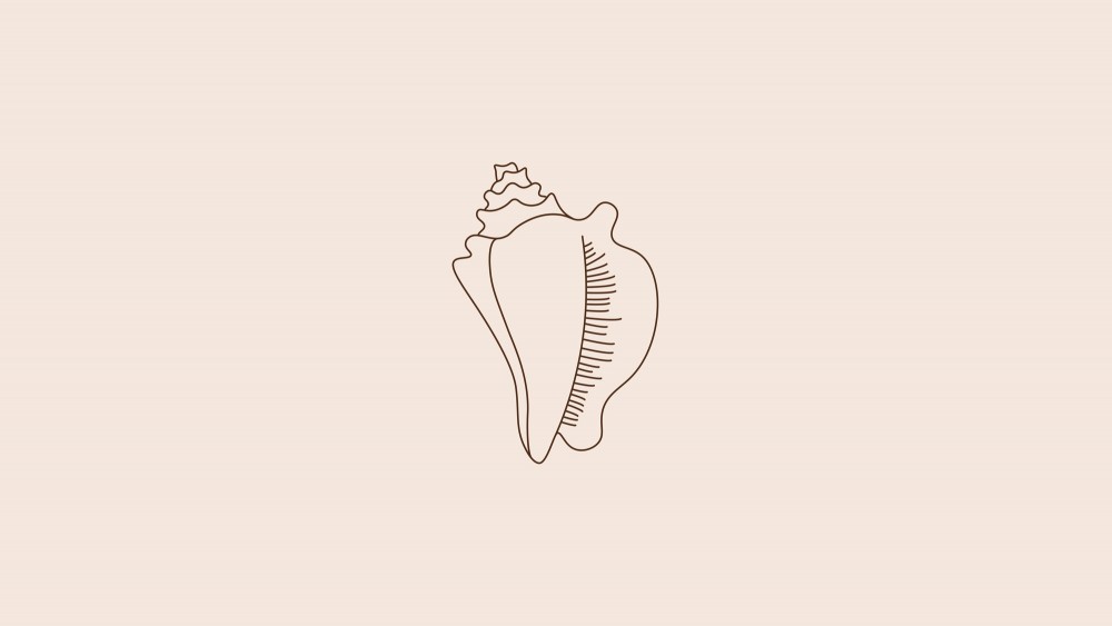
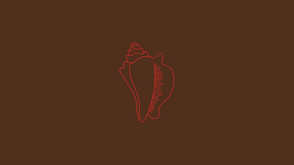
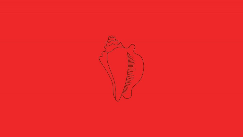
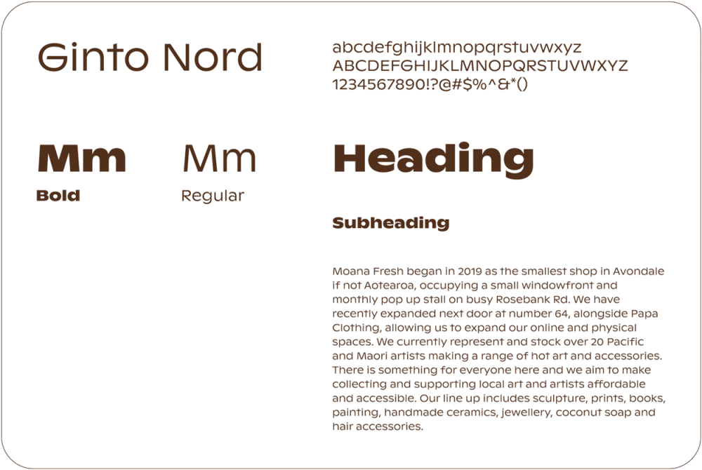
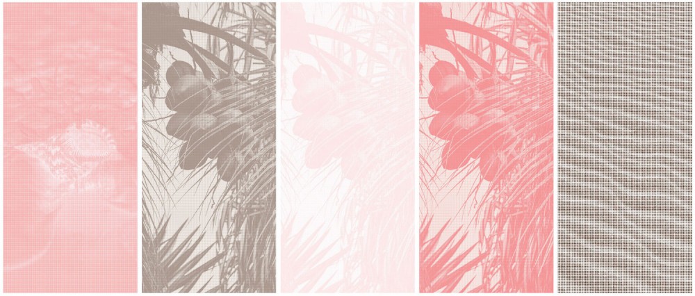
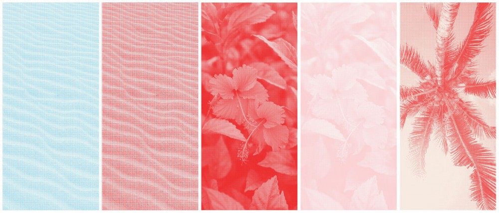
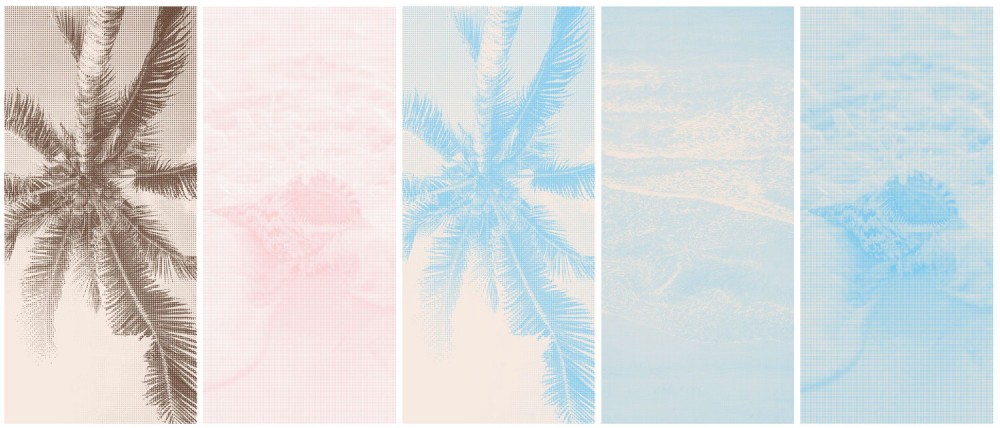
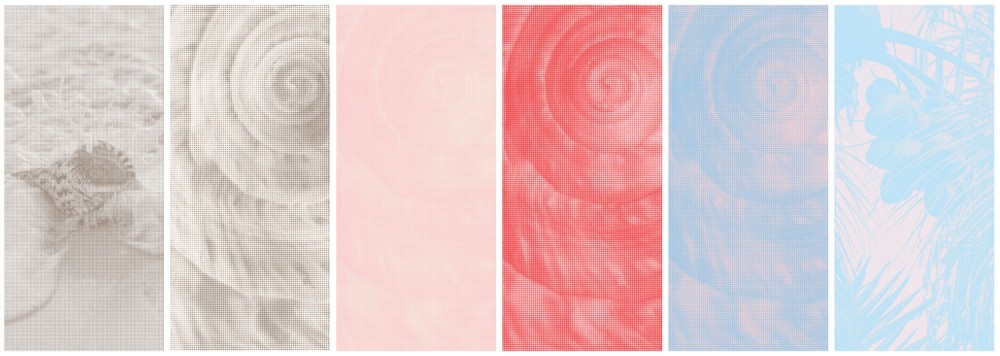
This is a brand guidelines journey developed for Moana Fresh to illustrate the process and outcomes of branding and marketing considerations for a creative Pacific lead enterprise. The full sample branding package is downloadable as a PDF.

Designers Sean Naufahu from Alt Group and Shahade Meredith have taken our original brand elements and created a more expansive branding overhaul. We also want to acknowledge our web developers Sarah and Ellyn Hui from Meide Studio as contributors to this project.

Visual Branding
texure-1.jpg

A brand is an intangible marketing or business concept that helps people identify a company, product or individual.

Core to a brand is what it looks and feels like – or in design speak we call this the visual identity. The key parts of a visual identity generally include name and logo, colours, type and images.

Together, these parts visually represent the brand in a way that is unique to others.

For example, here’s the parts of our visual identity:

Our Name & Logo

A core underpinning of our aesthetic is referencing the Pacific. The gothic font used in our logo is a loving reference to the Hawaiian Kingdom, as well as the slight slant of the letters symbolising the movement of the moana.

moana-fresh-new-logo.png

Our Conch Brandmark

Our colours create comfort and a welcoming feeling.

The pink colour found in a lot of our branding is inspired from the inside of a conch shell. Both reclaiming pink away from gender binary associations and connecting it to an object core to many Pacific cultures. The sound of the conch is used by many as a way of signifying events and summoning people home. This conch shell pink becomes a metaphor for the home and shelter we seek to provide for Pacific and Maori artists and creatives. The red symbolises mana and prestige within many Pacific cultures.

black-new.jpg
blue-new.jpg
brown-new.jpg
off-white-new.jpg
pink-new.jpg
red-new.jpg

Colours

Our colours create comfort and a welcoming feeling.

The pink colour found in a lot of our branding is inspired from the inside of a conch shell. Both reclaiming pink away from gender binary associations and connecting it to an object core to many Pacific cultures. The sound of the conch is used by many as a way of signifying events and summoning people home. This conch shell pink becomes a metaphor for the home and shelter we seek to provide for Pacific and Maori artists and creatives. The red symbolises mana and prestige within many Pacific cultures.

#EC2828
R236 G40 B40

#77C9ED
R119 G201 B237

#FBCED0
R251 G206 B208

#F6E7DC
R246 G231 B220

#51301C
R81 G48 B28

Working Colour Combinations

mf22_brandguidelines1.jpg
mf22_brandguidelines2.jpg
mf22_brandguidelines3.jpg
mf22_brandguidelines4.jpg
mf22_brandguidelines5.jpg
mf22_brandguidelines6.jpg
mf22_brandguidelines7.jpg
mf22_brandguidelines8.jpg
mf22_brandguidelines9.jpg
mf22_brandguidelines10.jpg
mf22_brandguidelines11.jpg
mf22_brandguidelines12.jpg
mf22_brandguidelines13.jpg
mf22_brandguidelines14.jpg
mf22_brandguidelines16.jpg
mf22_brandguidelines17.jpg

Type

We use Ginto Nord as our secondary typeface. We love the roundedness of the typeface and how it can feel quite welcoming.

ginto-nord-web.png

Imagery

Through our instagram, we realised we loved layering and using texture. Having an asset library of textures, gives our brand a grounding consistent feeling.

Our photography on our website and instagram is very relaxed and often includes people.

imagery-new-1.jpg
imagery-new-2.jpg
imagery-new-3.jpg
imagery-new-4.jpg

Templates

These templates are used throughout our business, creating a sense of cohesion and brand identity.

mf22_brandguidelines22.jpg
mf22_brandguidelines23.jpg
mf22_brandguidelines25.jpg
mf22_brandguidelines26.jpg

Instagram Grid Template

• Built on Canva
• Can be used for Instagram square and portrait posts and stories
• Room to be playful with texture and colour
• Option to include motion

instagram-grid-web-2.jpg